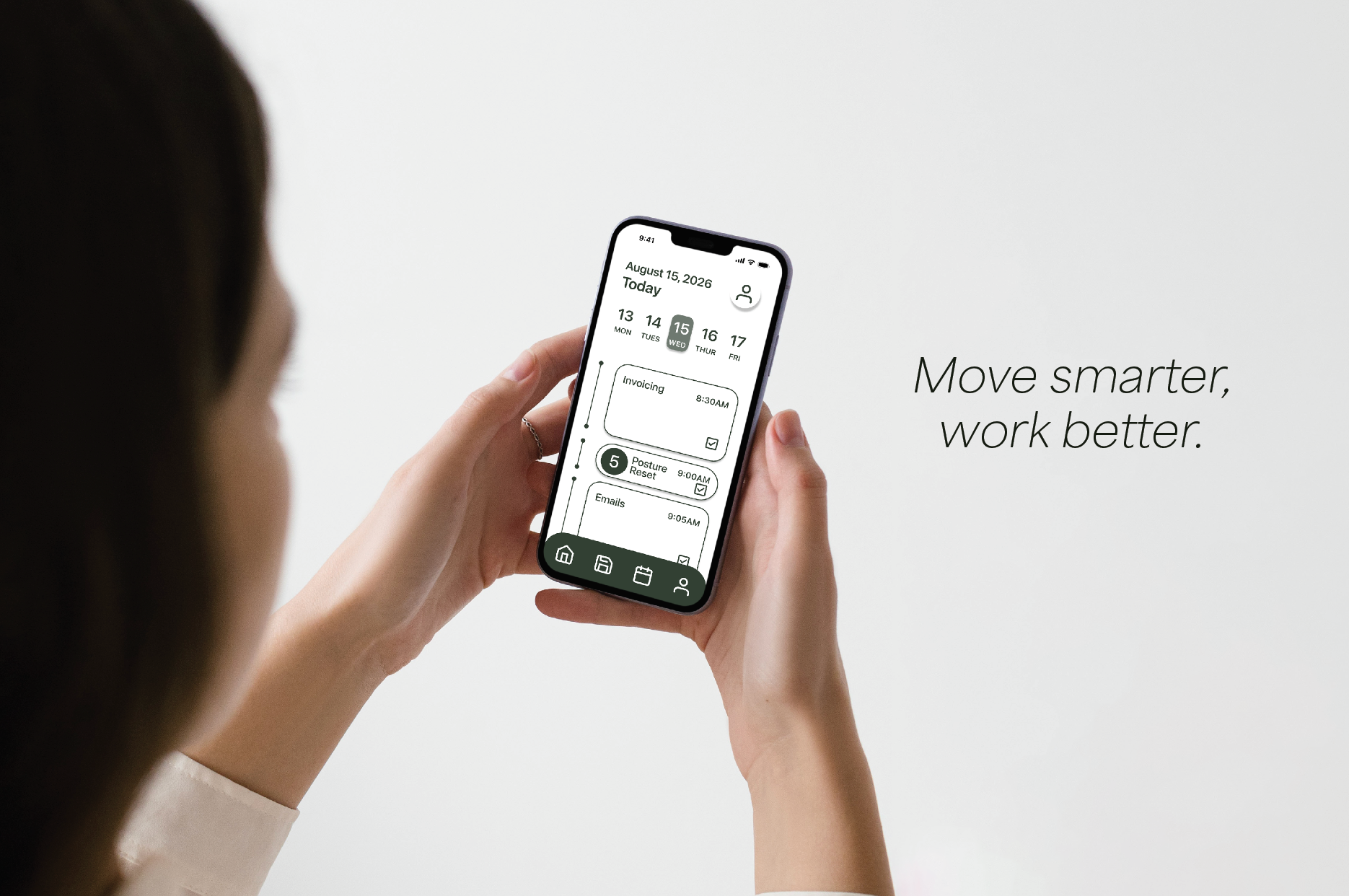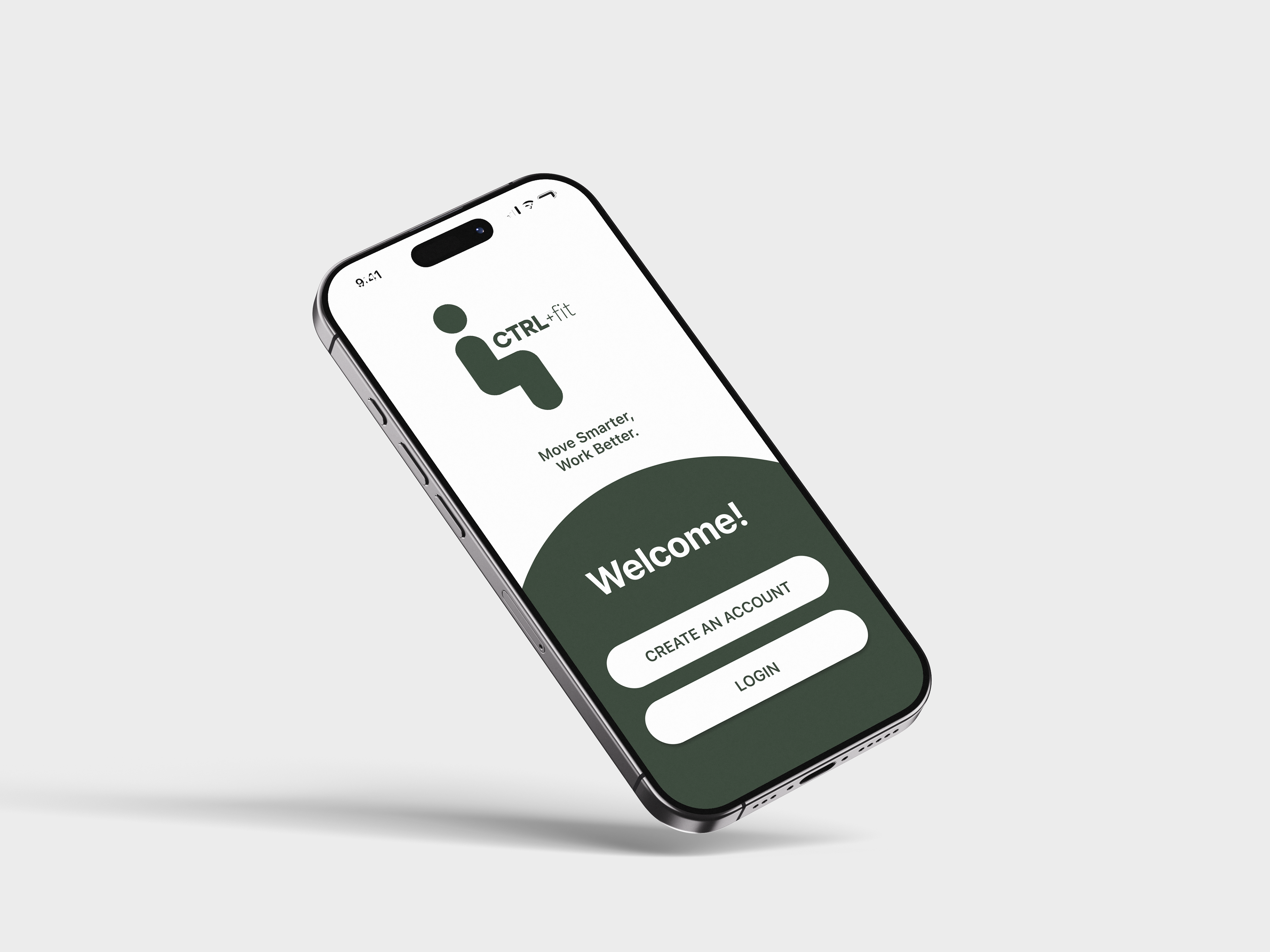
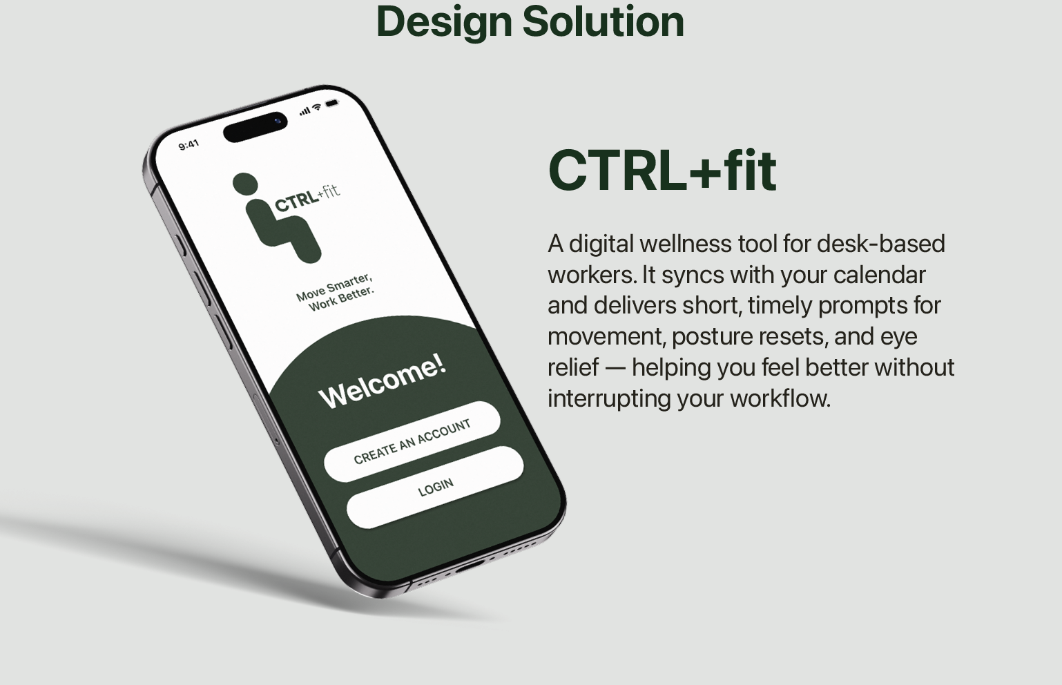
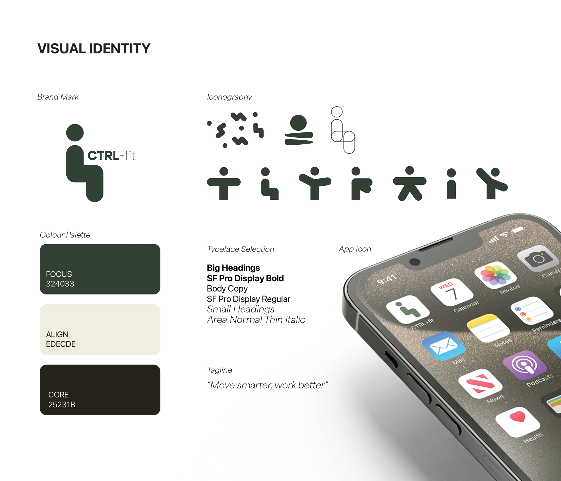
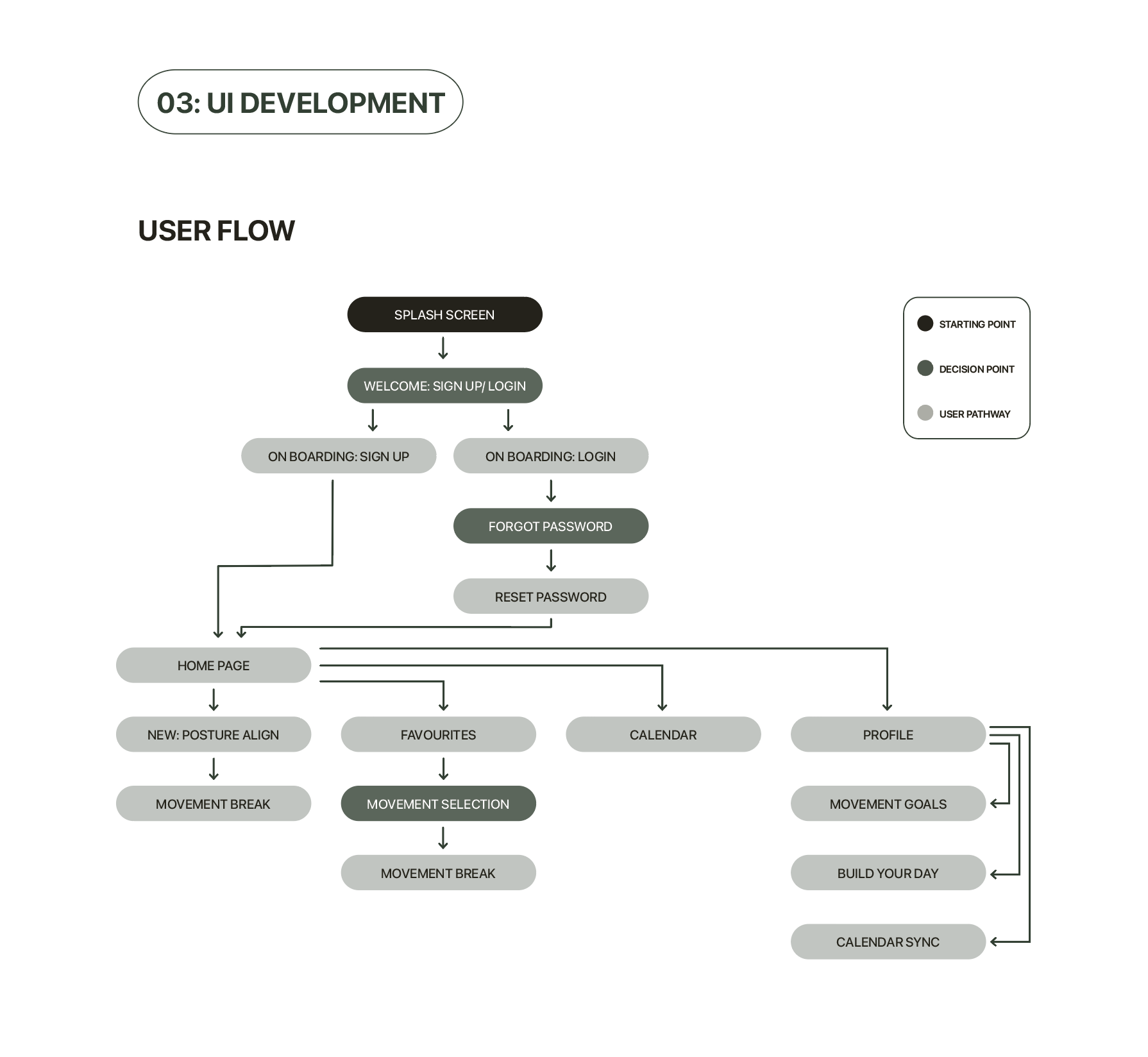
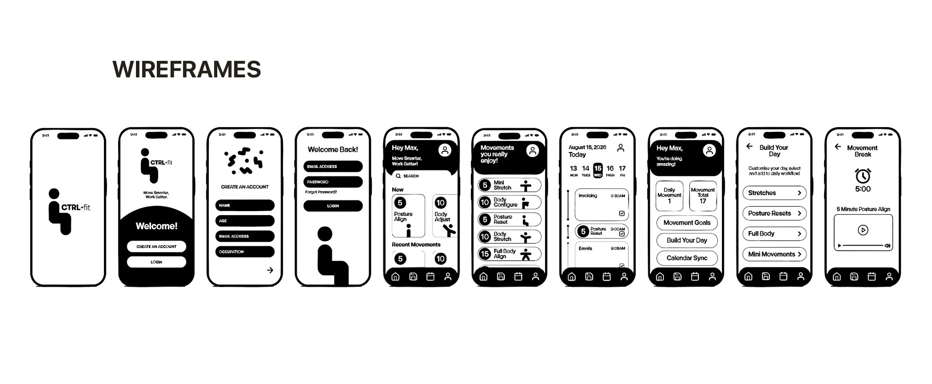
I developed wireframes, user flows, and interface mockups to optimise usability and visual hierarchy. The design process involved selecting colour palettes, typography, and iconography that reflected calm, clarity, and accessibility. Iterative prototyping and feedback ensured a user-centred approach that aligned with the app’s wellness goals.
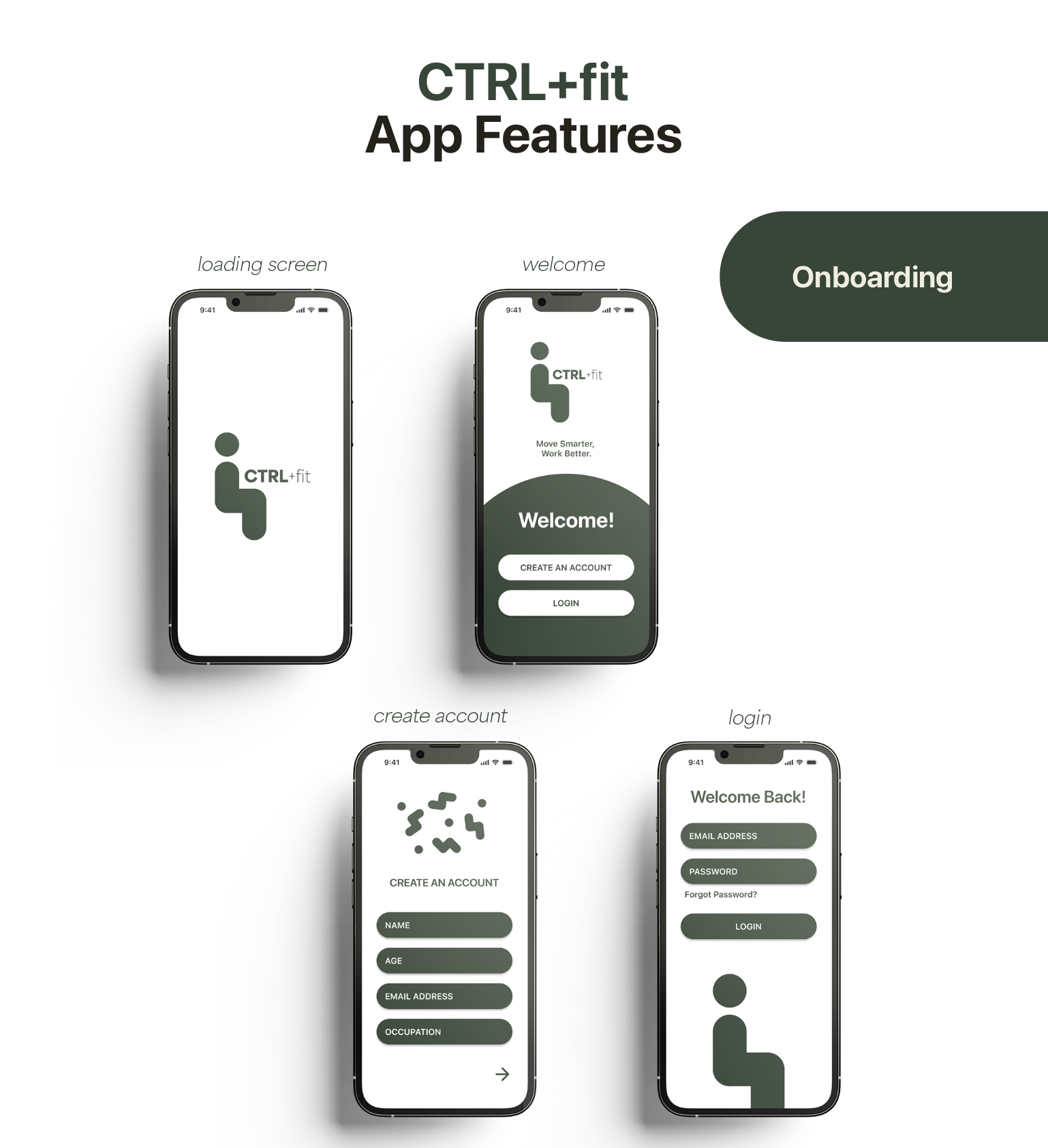
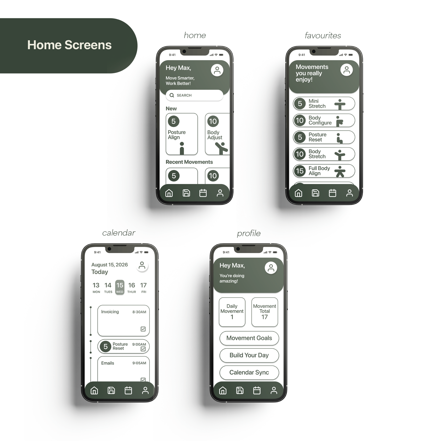
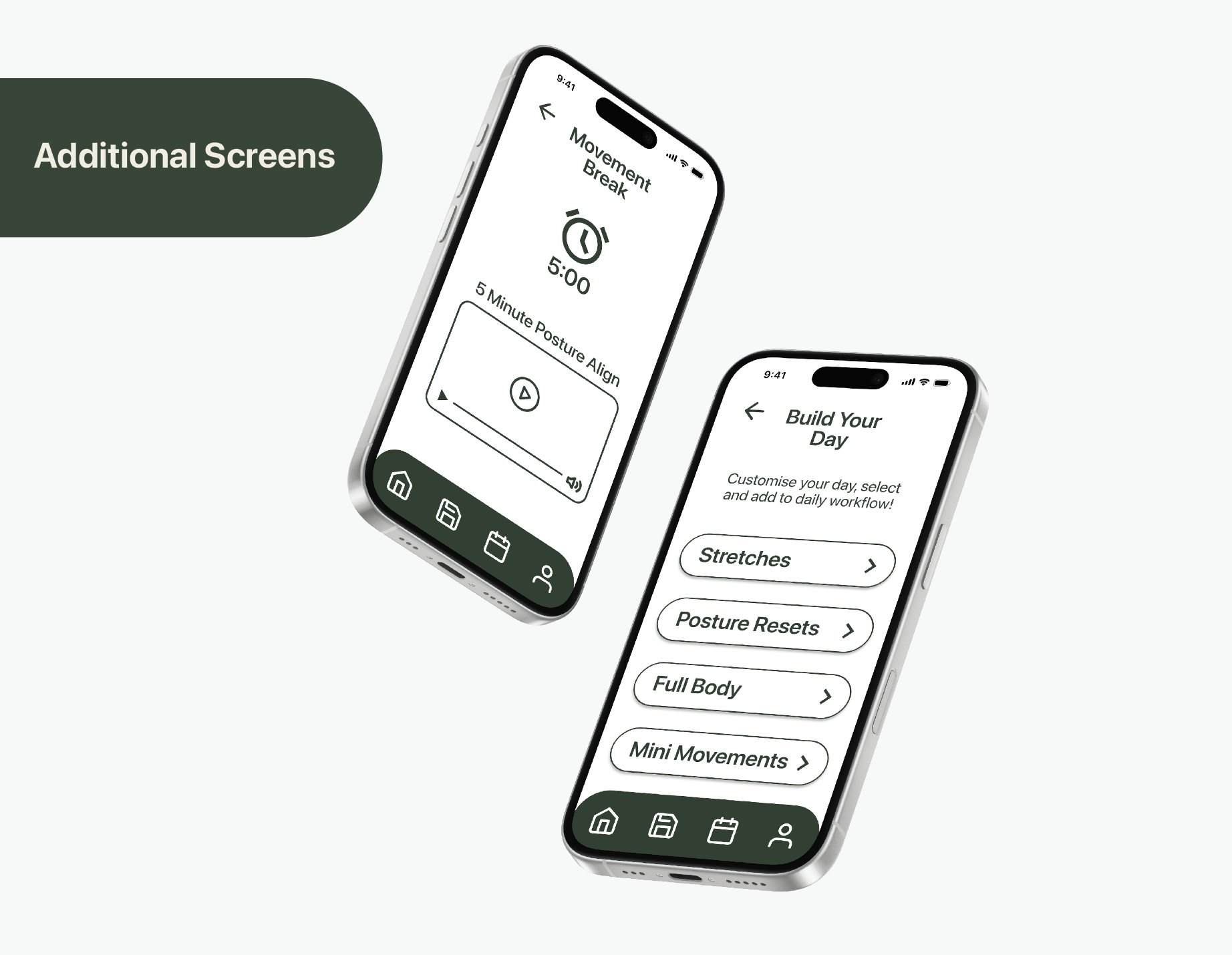
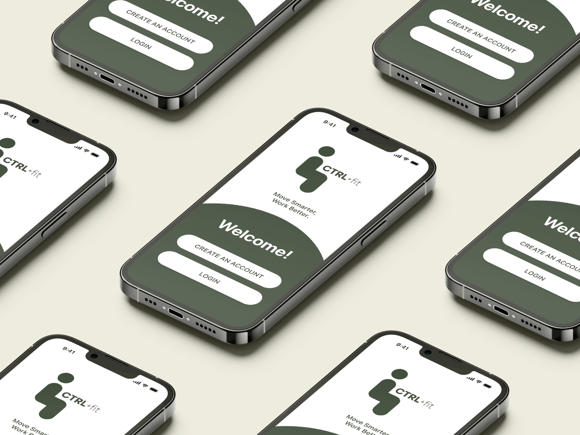
The final designs include a cohesive visual identity, high-fidelity screens, and interface components that support a seamless user experience. CTRL+Fit demonstrates how thoughtful UX/UI design, brand identity, and visual communication principles can create engaging, functional digital products that enhance user wellbeing.