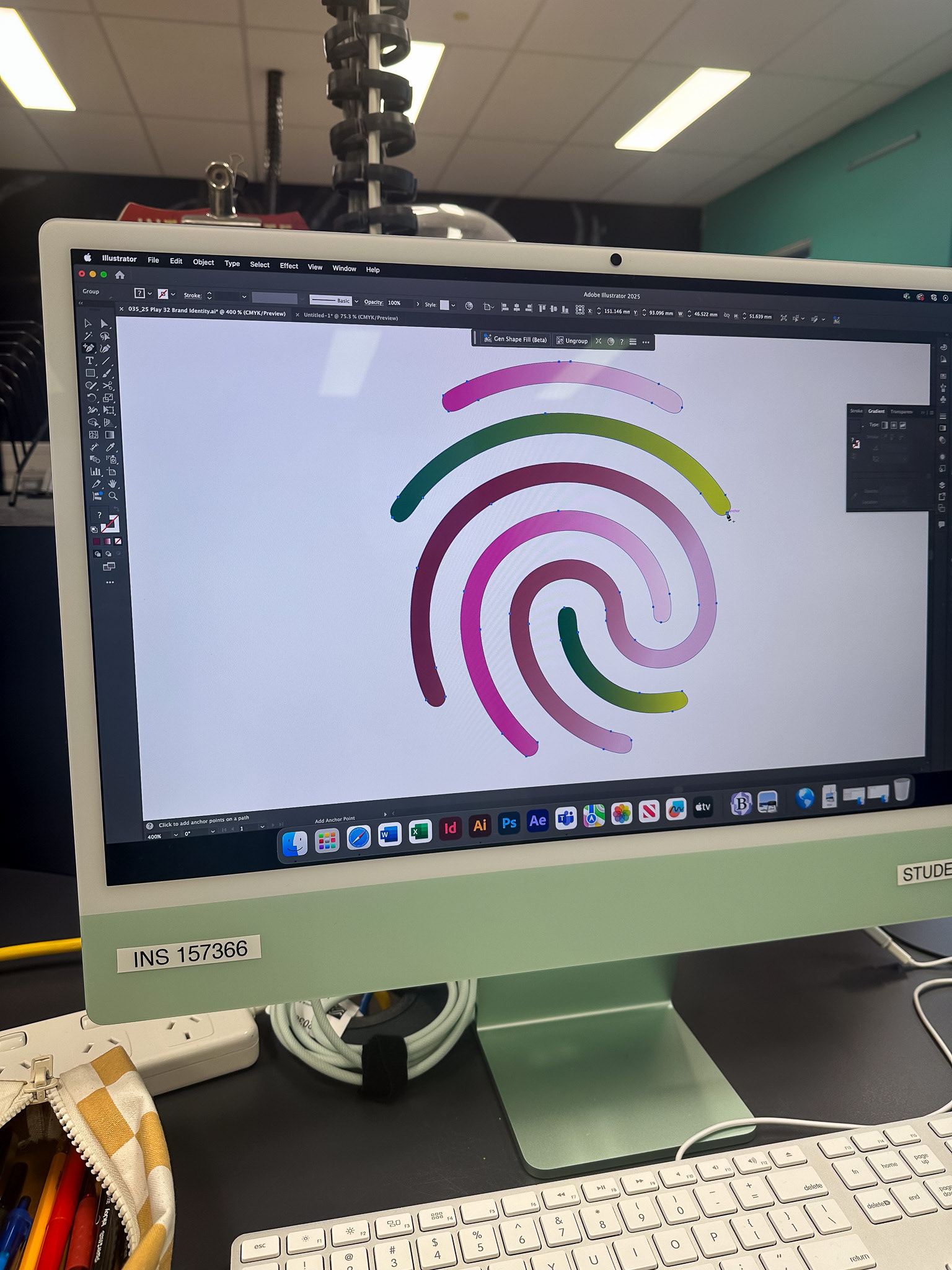
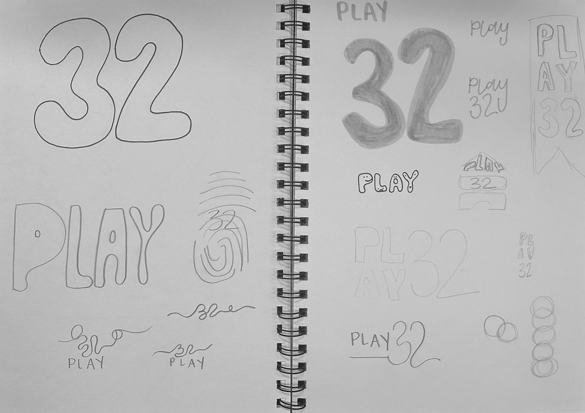
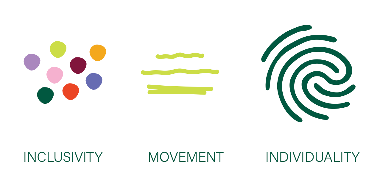
During the design process, I explored various typographic treatments, colour palettes, and illustrative motifs to capture the spirit of play. Moodboards, sketching, and digital experimentation helped refine ideas and align them with the Olympic theme. Collaborative feedback sessions allowed me to ensure that the identity felt inclusive, energetic, and visually engaging for a global audience.
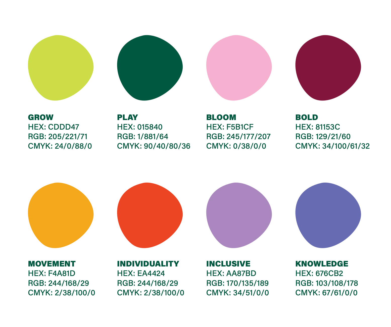
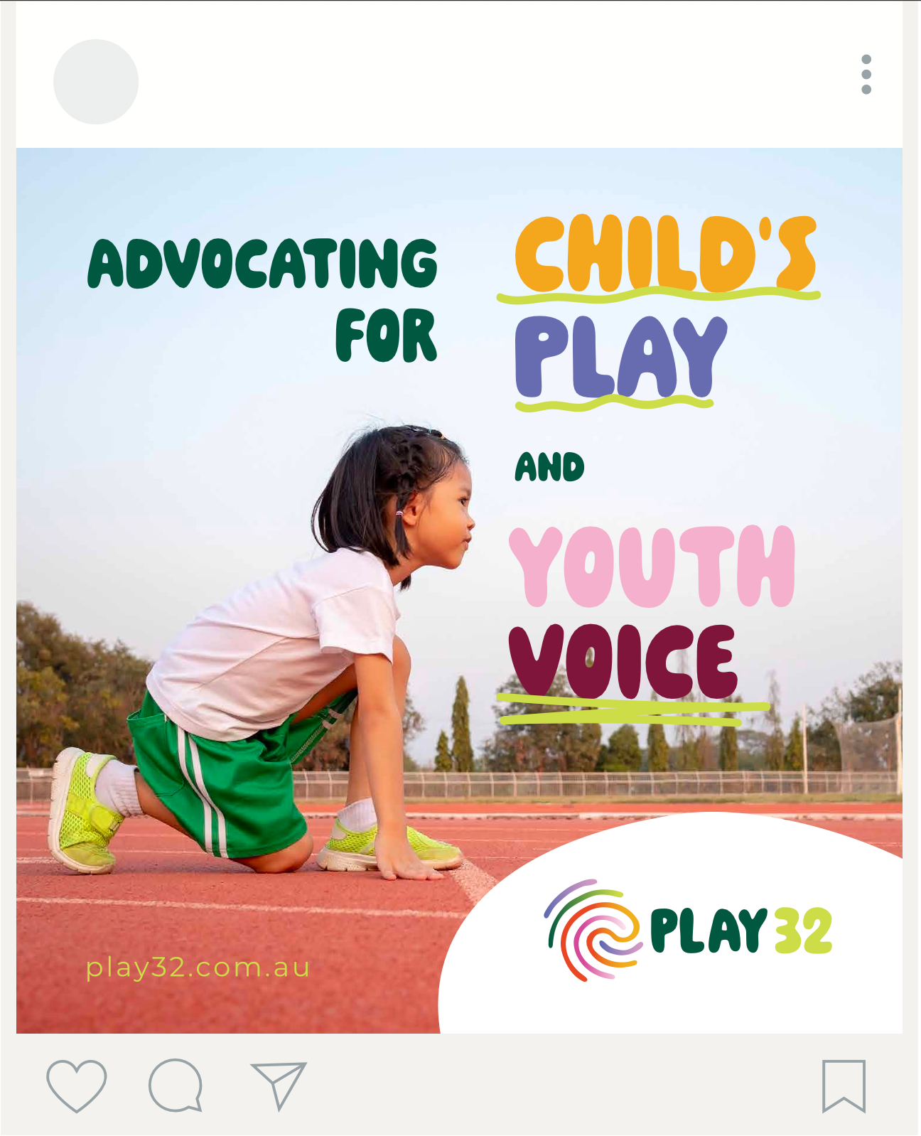
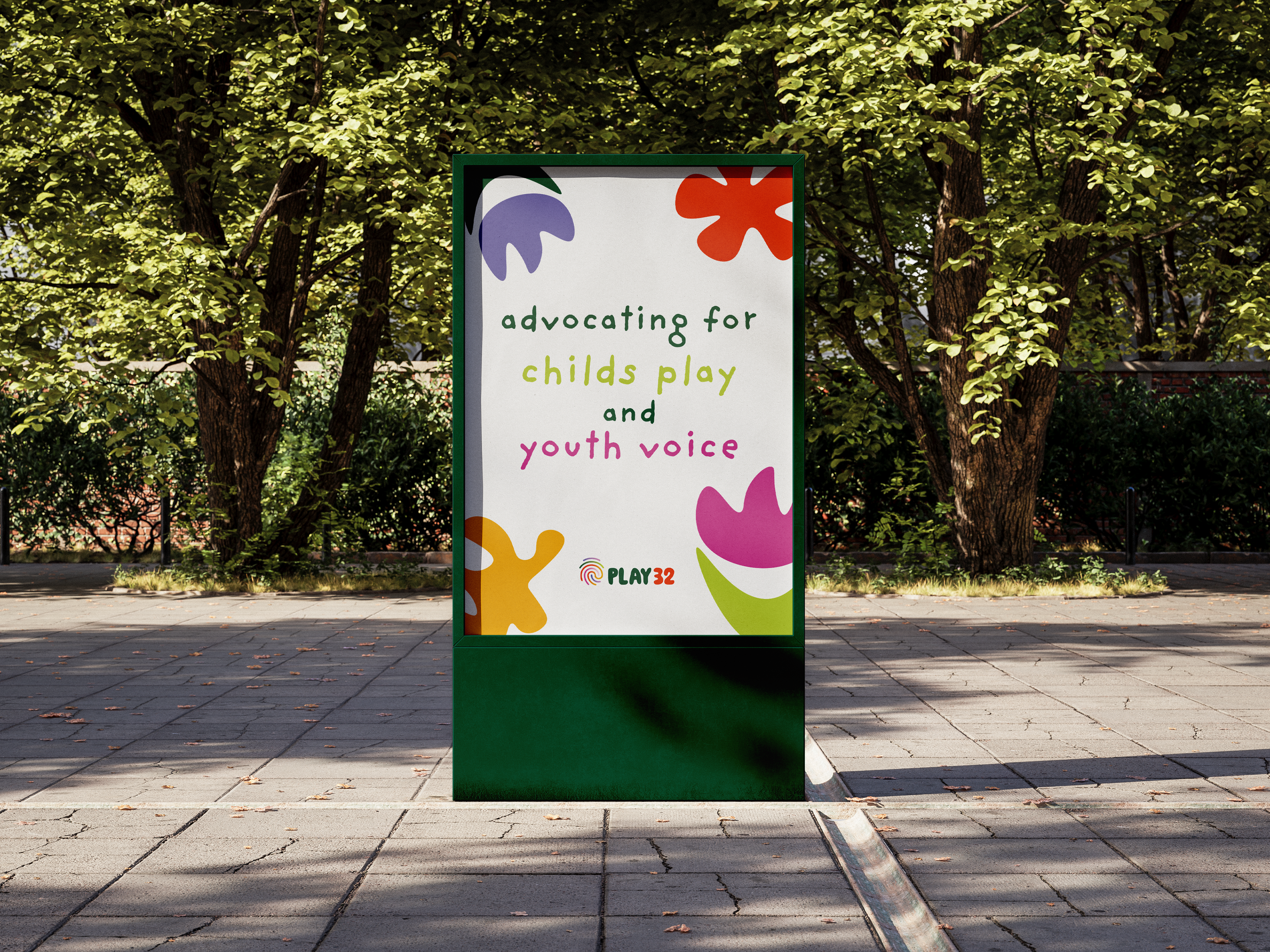
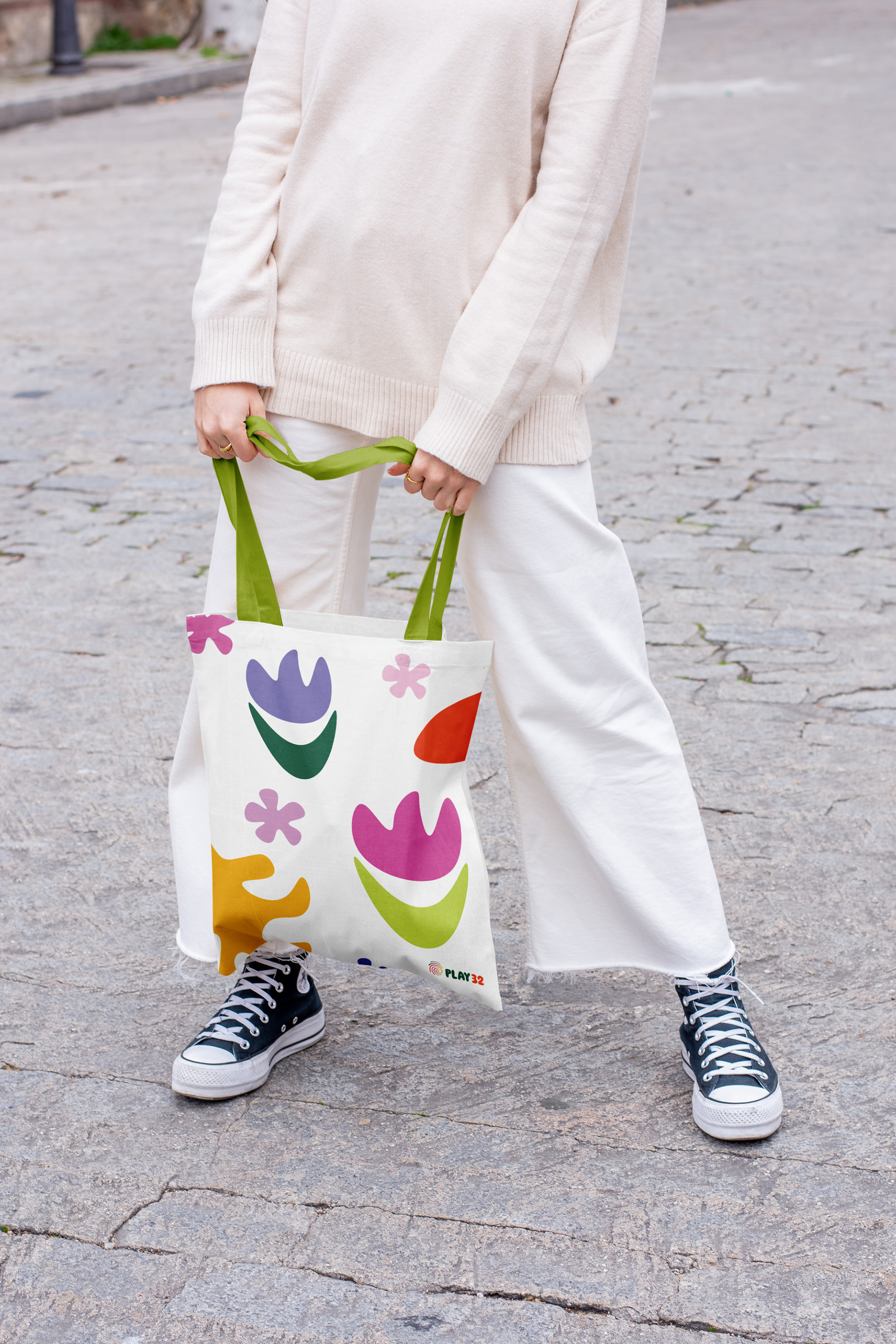
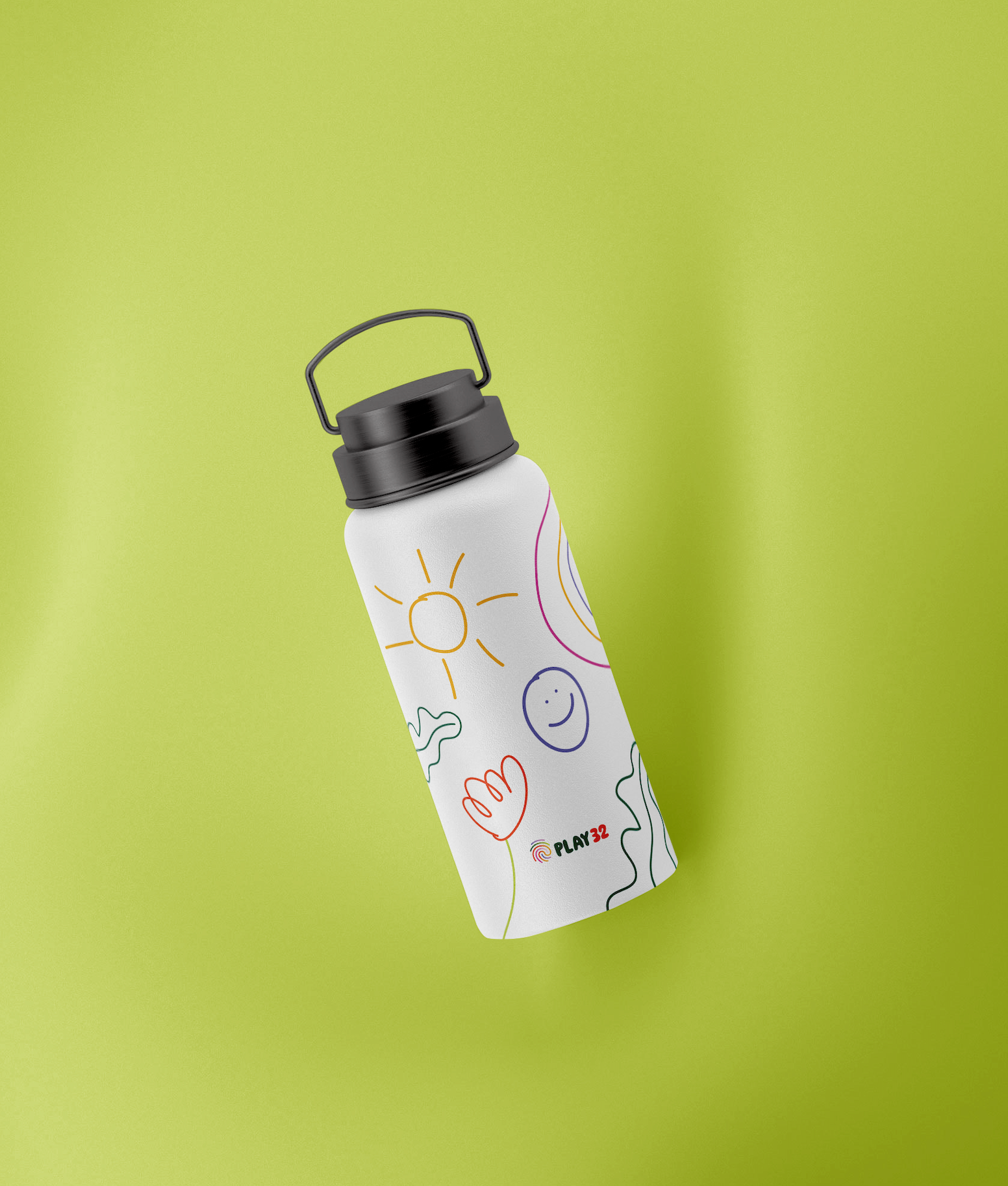
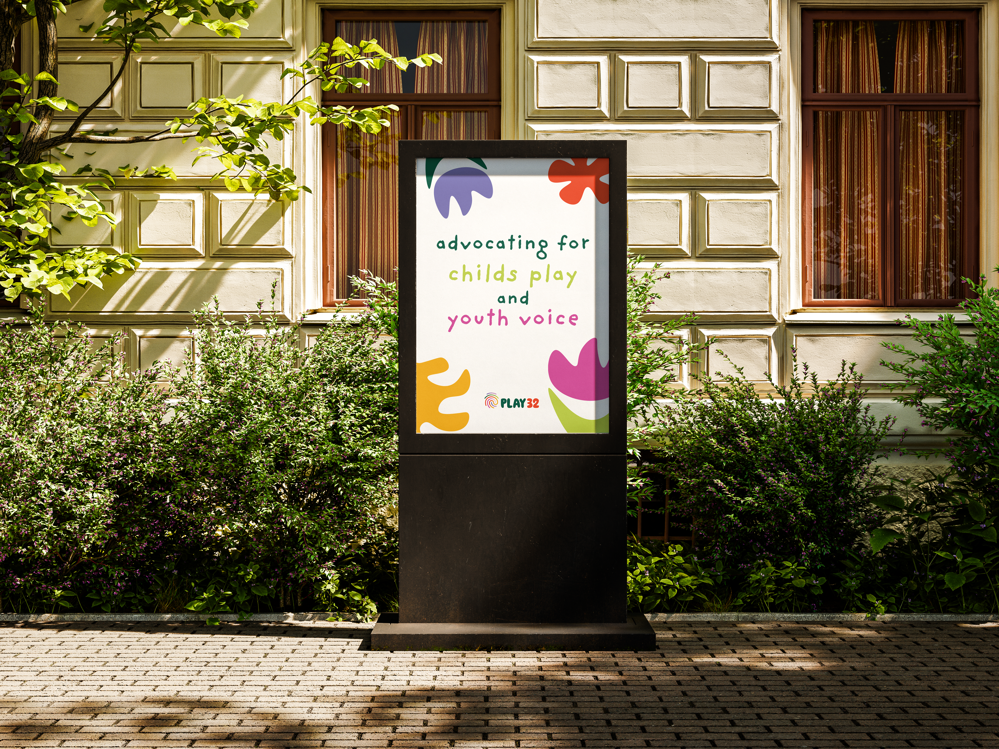
The final brand identity showcases a vibrant, dynamic visual language designed for applications across print, digital, and environmental graphics. The logo and supporting graphics reinforce the message of participation, creativity, and childhood joy. This project highlights how thoughtful visual communication design can bring purpose-driven branding to life, creating meaningful connections with audiences.